Hey friends, it's EK. So I've pulled out my blend EK's Dragon Fire from Doodles Paper Playground and played with it today. I have heard grumblings that this mix is just a little too dark and grungy, and I wanted to show that I could brighten it up and make it feel more main stream.
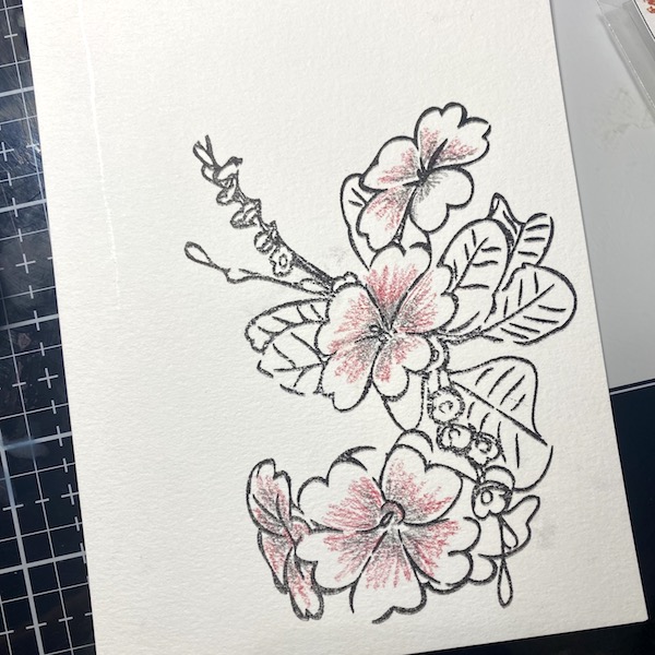
I started by stamping a Stamplorations floral image onto some watercolor paper with waterproof ink.
Using a combination of both black and red watercolor pencils I filled in the flowers, to help pull the colors in the Dragon Fire blend. Then using a water brush I blended out the colors.
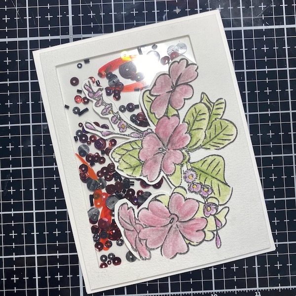
Using a combination of both olive and a brighter pale green, I filled in the leaves trying to brighten the image up. For the little floral buds I used a dark red violet pencil to punch up the red tones a bit.
Using an xato knife, I hand cut the shaker window.
I built up the shaker element and filled the window with EK's Dragon Fire.
I adhere the shaker window to an A2 card frame, leaving the background white, hoping to keep the image light.
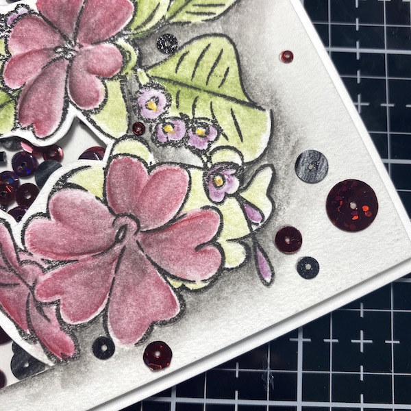
The flowers looked a little drab, so I punched up their color, still using just the red and black watercolor pencils. I also added a heavy shadow around the bottom of the florals.
Finally, I added a few extra sequins in the empty space to help the card feel fully fleshed out.
What do you think? Does EK's Dragon Fire Sparkle Blend still look dark and grungy? Can you see how bold this mix can be? Let me know in the comments below. Until then, happy crafting.


No comments:
Post a Comment