Primarily a cardmaking and papercrafting blog featuring both my own creative designs-including the products and techniques I used to create them-as well as projects by the Sparkle Blends Designing Divas team and other Guest Designers. I welcome comments, design suggestions, and questions, but I do ask that they remain respectful and kind.
Wednesday, June 30, 2021
To Dive For
This blue haired mermaid is swimming along in a sea of beautiful shells, pearls, sequins and so much more.
The underwater scene came to life with the "Mermaid Kisses" stamp and die set from Brutus Monroe. Everything was colored with Copics and mounted atop a background from Catherine Pooler's 6X6 Seaside patterned paper pack. The sentiment was stamped in the coordinating Sea Glass ink.
Look close and you will find all sorts of under water creatures including various types of fish, seashells, sparkle discs, bubbles...the list goes on. And the color palette leaves so many options for coordinating patterned papers. I used pieces from Just Keep Swimming to decorate the outside of the card as well.
The pink starfish in the mermaid's hair are one of the many different clay pieces that include 3 different types of fish. I used various discs and sequins to create bubbles. And of course, the clear colored bubbles to complete this scene. If you love this blend as much as I do, swim on over to the shop and grab yours!
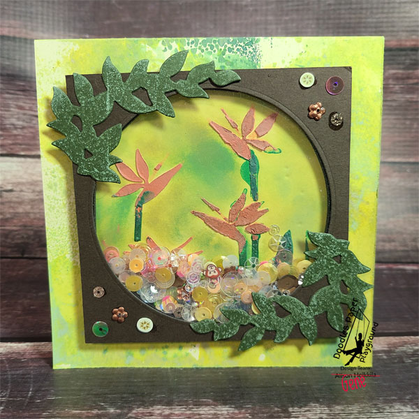
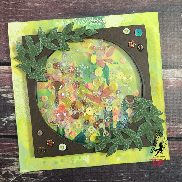
Hello! Alison Heikkila here. Hello! Today I am sharing a card that was created by my husband Gene for the June Sparkle Blend release from Doodles Paper Playground. He really liked the "Go Bananas" Sparkle Blend, so he decided to go with a rainforest vibe on his card.
He found an old Bird of Paradise stencil that he liked a lot, so he used a couple of embossing pastes and applied it to cardstock. After they dried, he inked it up a bit to give kind of a blurry, jungle background. Using some dies from Stampendous for his window and the foliage around it, he created his shaker. He inked the foliage a bit by tapping on some Distress Oxide Ink. This gave the leaves a lot of texture.
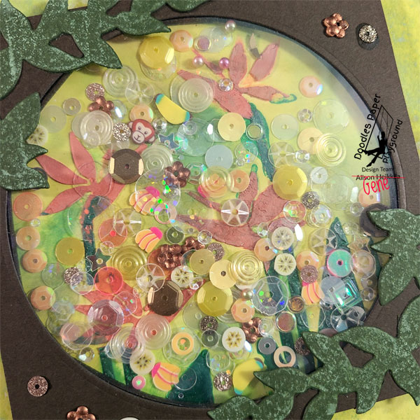
His window is quite large, so he wanted to use a lot of the "Go Bananas" Sparkle Blend in the shaker panel. Instead, I offered him some of my beloved (and retired) "Broken Glass" Sparkle Blend to fill in the window, while still allowing you to see what's inside. In the photo above, you can see the clear and opalescent sequins....that's from "Broken Glass." Everything else is from "Go Bananas," so look for the little banana slices, the monkey heads, the various shades of yellow in different styles of sequins, and even 2 styles of full sized bananas! There are a lot of great elements in this Blend, and I really love the surprising pops of bright pink and bronze.
For his card base, Gene did a bit of ink smooshing with the same colors of Distress Oxides that he used behind the shaker window. I believe the colors were Rustic Wilderness, Twisted Citron, and Cracked Pistachio.
This card gave him a bit of trouble. It's not easy to use different colors of embossing pastes on such small areas, especially since they were from different brands with very different consistencies. But in the end, I really love how his card turned out. There is so much movement in his shaker window and those Sparkle Blends are really on display. Please visit the Sparkle Blends Shop on Etsy to see the entire new collection, plus some new goodies that Amber has added to the shop! And make sure you join the Sparkle Blends Fan Club on FB to always get fantastic inspiration on how to use those Sparkle Blends. Thanks so much for stopping by. Have an inspiring day!